Anton Stankowski · Exhibition · Information · Catalogue · Press · Contact · German Version · Credits

![]()
Anton Stankowski
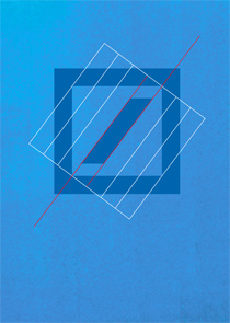
Logo Deutsche Bank
1974
Post-war
Logos and Graphic Design
Who in Germany isn’t familiar with them: the Deutsche Bank sign,
the Viessmann and REWE trademarks, or the old SEL symbol? As a graphic
designer, Stankowski worked on all facets of visual communications, but
he was especially skilled at designing logos and complex visual systems.
Here, the interplay of art and design is most obvious. He refused to separate
the two fields, and thanks to this, Stankowski’s graphic designs
developed their own, unique, previously unknown iconography. To his artistic
ideas, he added the notion that information had to be conveyed, so that
some of his logos had the aesthetic attraction of a work of art. Stankowski
designed numerous logos, and many are still in use today. He not only
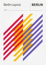
worked with companies, but also with institutions or cities, such as Berlin,
for which he designed a logo in 1969. Stankowski felt it was important
to have direct contact with his clients. Many of his “corporate
images” were developed in this manner, and have remained valid over
the years, to this very day.
Post-war Logos and Graphic Design
Curator: Karl Duschek
Anton Stankowski
Berlin Layout
Anton Stankowski
Logo
Brochure PDF