Anton Stankowski · Exhibition · Information · Catalogue · Press · Contact · German Version · Credits

![]()

Anton Stankowski
Sulzer, Cover of brochure
1933
Pre-war
Commercial Graphics
Stankowski was concerned with arranging contents, with their informational
balance, and with the balance between tension and harmony in the overall
concept. These fundamentals can be seen from beginning to end in his graphic
works. During his student days at the Folkwangschule, he created his first
groups of commercial graphics. After two years free-lancing for Canis’s
»werbe-bau« agency in Bochum, Max Dalang invited Stankowski
in 1929 to work in Zurich, which later became the center of “New
Design“ and “Concrete Art.” Here, Stankowski was free
to live out his ideas. He brought photography into his graphic design,
gave it a new kind of typography, and added a dynamic element by placing
writing at a diagonal or using geometric shapes, frequently just in sections.
Information was always the goal. Stankowski also declared “sacred”
the clear Akzidenz-Grotesk typeface that he employed thereafter. No additions,
no background should distract from the object. As a consequence, his own
photographs, which he used, were also clear and “objective.”
Before the war, his “spiritual/intellectual laboratory” focused
on drawing and painting, which did not have as much importance for him
as graphic design did, although later this relationship was reversed.
Yet even in those days, it was clear that his interest in surfaces and
space accompanied him in all creative fields and that both elements influenced
each other.
Pre-war Commercial Graphics
Curator: Jörg Stürzebecher
Anton Stankowski
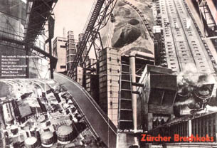
Zürcher Brechkoks
1931
Folding brochure, 33 x 48 cm
Anton Stankowski
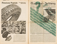
Special section of the
Basel National-Zeitung
1935
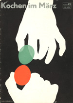
Anton Stankowski
Magazine cover, “Cooking in March”
First issue
(December 1933)
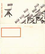
Anton Stankowski
Folding brochure
“Fortschritt“ chair.
1929